

One Simple Design Principle can Deliver New Concepts at Lower Cost and with Less Environmental Impact.
This was one of the most technically exciting projects we've worked on. Not because it was the biggest, or the boldest, but because of the brief: to reuse as much existing kit as possible, taken from their Stratford White City store, and to create something worthy of being in the heart of the Lake District.
When Ellis Brigham approached us to deliver a new store in Keswick, we saw more than just another retail fit out. We saw an opportunity to prove that great retail design doesn’t always start from scratch. Sometimes, the smartest thing you can do is look at what you already have, and build something remarkable from it.
The Brief: Reuse Without Compromise
The relationship with Ellis Brigham came through Gareth Chivers, who had delivered EB’s Outsiders Liverpool and Coal Drops Yard stores in a previous role, in a previous life. Our friends at WDC Creative, their creative agency, had also recommended us, and together we were tasked with evolving the current concept into something relevant, robust and new as well as being old.
The brief was clear. Take their current store scheme, evolve it, and implement it using as much of the existing fixtures as possible. Financially, it made sense. Environmentally, it was a no-brainer. Creatively, it was a challenge WDC got stuck into with our support.

Getting Practical with Reuse
This wasn't just about moving furniture from A to B. We worked closely with Ellis Brigham to understand what stock was available, both in the closed Stratford store and in their warehouse, and with WDC to figure out how it could align with the new concept.
Ellis Brigham wanted 50 percent of the store to be either out of stock that they had at their warehouse or recovered from Stratford City, but give it a completely new look and feel within Keswick.
We assessed every piece. Some sections, like footwear, were built entirely new (well nearly). Others, like apparel were based on older uprights and mid-floor kit. We had to make sure that everything felt coherent, current, and part of the same design story.
Engineering Meets Interior Design
One of the advantages we had was that a lot of the original kit had been developed by members of our team in a previous life. That familiarity helped. The kit had worn incredibly well over eight years, and from an engineering perspective, it was still in great condition.
Where necessary, we updated material finishes, using natural timbers, plywood, and tactile details to create warmth and visual consistency. The new finishes worked harder. The scheme felt fresh and authoritative without ever feeling recycled.
"You wouldn't recognise it," Ben Holden said. "If you walked in from the Stratford store to the Keswick one, you'd never know it was the same shop. It just feels very, very different."

Flagship Features: What We Designed
and Why
1. Footwear: A Hero Zone

Footwear area
Footwear is one of the most competitive categories in outdoor retail, so it had to land with impact. This area was completely new - fitted benches, a digital foot-ID zone, and a testing ramp that mimics local terrain.
"That's the real draw. You can buy fell running shoes, rock climbing trainers, winter walking boots, it's all within that area, and it had to be the most authoritative part of the store."
We retained one piece from the original kit, the footwear shelf, but everything else was new. Materiality remained consistent with the rest of the store to maintain visual flow.
2. Backpack Area: A Mix of Old and New

Backpack area
We reused a lot of existing fixtures here, but added new backpack presenters to help products look worn-in and ready for the trail. Flat backpacks aren’t inspiring. Our solution gave them structure and shape, and reflected the assisted-sell approach that Ellis Brigham is known for.
“You don’t choose your backpack for the aesthetic. You choose it for the fit. There’s a whole service element right there.”
3. The Climbing Rope Detail

Orange Rope Detail (left)
Throughout the store, flashes of orange climbing rope provide a visual thread that ties everything together. It’s genuine rope, not a visual gimmick, and it references Ellis Brigham’s history in climbing while subtly linking to their rebrand.
“It’s not just a rope. It’s a real climbing rope. That was more important than matching the brand orange exactly.”
This also gives the opportunity to change the visual language of the store with a quick change of one simple element. If they have a flagship product, or brand, or want to section the store into different areas.
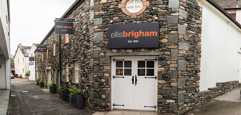
4. Working with the Building

Store Entrance
The store sits in a beautiful, historic building. That came with quirks - wonky walls, irregular floors, and nothing quite square, but we leaned into that character. It’s part of the Keswick charm.
“You’re fixing into a 200-year-old building where nothing is straight. That’s probably one of the biggest challenges we faced.”
We designed carefully, keeping interventions minimal where possible and making sure the design respected the building’s heritage.
The Environmental and Economic Case
One of the standout results of this project is the efficiency we achieved. We estimate that Ellis Brigham saved 35 to 40 percent of the cost of a full new fit out by reusing existing fixtures. That’s a massive win, not just in pounds, but in carbon.
Yes, there are costs involved in extracting, transporting, and refurbishing the kit. But those are far outweighed by the benefits of not remanufacturing it all over again.
“You get massive carbon benefits. And the kit will easily do another eight to ten years, maybe more. Some might say it was over-specified, but that’s paying off now.”
Rapid Turnaround, No Compromise on Quality
This project was delivered in 50 percent of the time we’d usually want. We worked with minimal drawings, supporting suppliers directly in their factories to achieve the quality this store deserved.
“They came in 36 hours before handover and said, ‘Wow. We’ve never seen a site so calm, so well under control.’ There was no snagging. Just a clean handover.”
That kind of comment from the MD and leadership team says everything. It’s a reflection of the trust we built, the collaboration we had with WDC, and the precision of our delivery.
What happens next?
The Keswick store is a stepping stone (no pun intended). We’ve already had conversations about how this approach could scale. Larger stores in more traditional retail locations are being considered, and the principle of reuse is firmly on the table.
We’re not naming names yet, those announcements belong to Ellis Brigham, but it’s clear that this project has set the tone for what’s to come.
Why it matters
This project matters because it proves that retail interior design can be sustainable without compromising on quality. It shows that retail display design companies like ours can work hand-in-hand with creative agencies to bring their vision to life, without sacrificing control or clarity.
It also reinforces our belief in doing the right thing for our clients. We don’t own a factory. We’re not driven by filling a pipeline. We’re driven by creating the right outcome, with the right materials, for the right reasons.

If You're Thinking About a Project Like This...
If you’re a brand, a creative agency, or a retailer sitting on a store full of legacy fixtures, and wondering what’s next, get in touch.
We can work alongside your team to make smart decisions about reuse, design new elements that enhance rather than replace, and deliver retail experiences that feel new without throwing away what already works.
Engineering Meets Interior Design
One of the advantages we had was that a lot of the original kit had been developed by members of our team in a previous life. That familiarity helped. The kit had worn incredibly well over eight years, and from an engineering perspective, it was still in great condition.
Where necessary, we updated material finishes, using natural timbers, plywood, and tactile details to create warmth and visual consistency. The new finishes worked harder. The scheme felt fresh and authoritative without ever feeling recycled.
Because recycling is good. But reuse is better.
